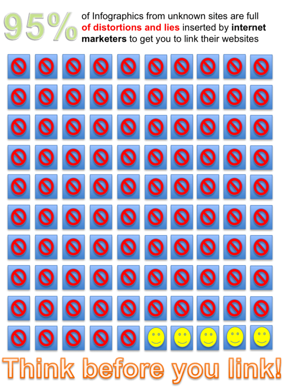
Ending the Infographic Plague – Megan McArdle – The Atlantic. “Remember: only you can prevent viral media from spreading.”
Ending the Infographic Plague – Megan McArdle – The Atlantic. “Remember: only you can prevent viral media from spreading.”

Correlation or Causation? – Business Week.
Statistics are easy: All you need are two graphs and a leading question.


Charts, graphs, and tables are on the decline. But what’s that newcomer in blue? Infographics!
Excerpt from the Annals of St. Gall, a yearly chronicle from an early-medieval Frankish monastery:
709. Hard winter. Duke Gottfried died.
710. Hard year and deficient in crops.
711.
712. Flood everywhere.
713.
714. Pippin, mayor of the palace, died.
715.
716.
717.
718. Charles devastated the Saxon with great destruction.
719.
720. Charles fought against the Saxons.
721. Theudo drove the Saracens out of Aquitaine.
722. Great crops.
723.
 Graph of the year – Statistical Modeling, Causal Inference, and Social Science.
Bill James (and others) have pointed out that true racial equality in baseball came, not when superstars such as Jackie Robinson and Willie Mays started joining major league rosters, but when there was room for ordinary black players to join their equally unexceptional white colleagues on the bench.
Similarly, graphical methods have truly arrived when journalists use graphs to make ordinary, unexceptional points in a clearer way. When making a graph, and including it in an article, is easy enough that it’s done as a matter of course.
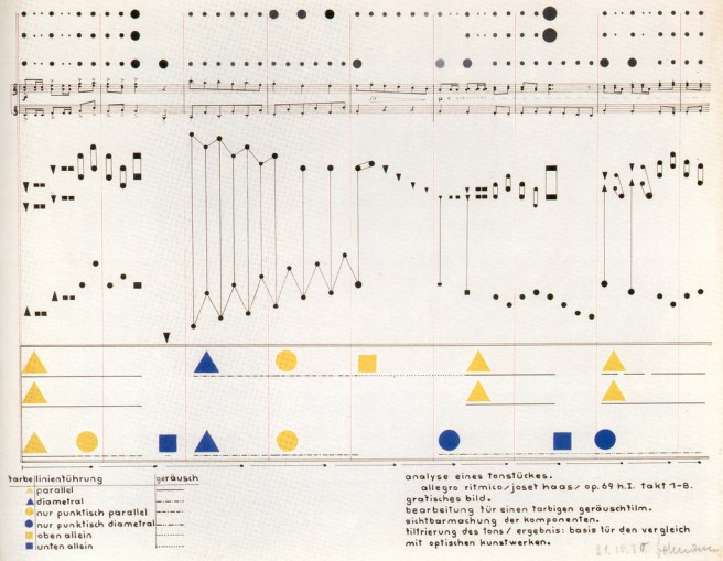
Heinrich-Siegfried Bormann – Visual analysis of a piece of music from a color-theory class with Vasily Kandinsky. October 21, 1930. (via)

The Beatles: Authorship and Collaboration from Michael Deal’s exploration of Beatles music through infographics. Looking forward to what comes out of the Charting the Beatles project. (via the ever-reliable Wehr in the World)
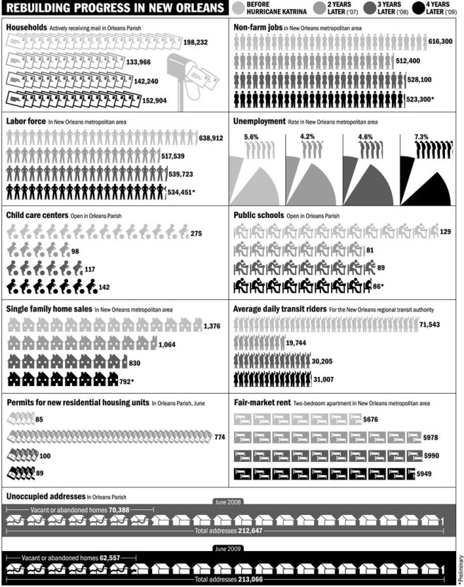
The State of New Orleans by Nigel Holmes for the New York Times.


