Rob Giampietro started a collection of imagery from the New Yorker fiction pages, 48 so far. Lots of good stuff there.
Tag: design
10 Things I Have Learned, Milton Glaser’s life lessons.
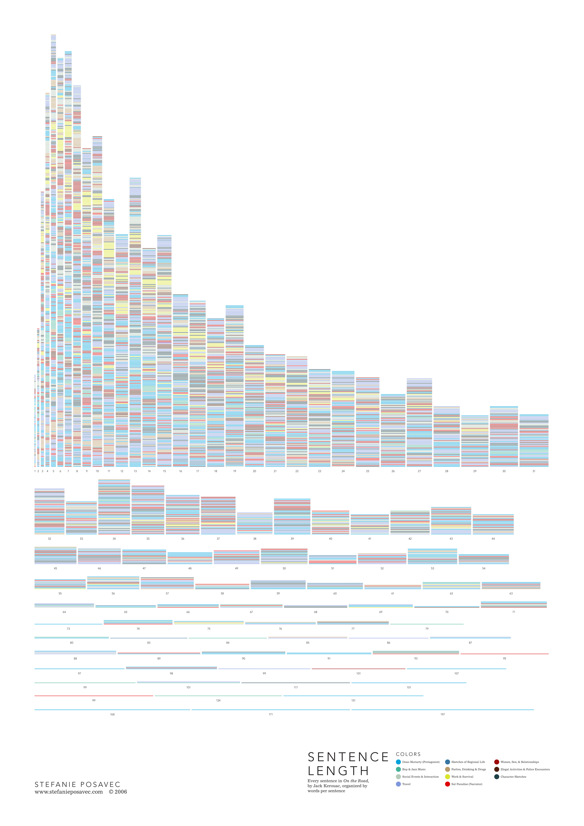
Stefanie Posavec made a diagram of every sentence in On the Road organized by words per sentence. Here are more literary diagrams.
Pecha Kucha Night is an informal gathering of presenters who are limited to 20 slides of 20 seconds each. So, theoretically, it’s a forum with less rambling and more variety in the course of an evening. Lots of cities are having them now. Could be cool. The next Atlanta Pecha Kucha will be next Sunday at Octane Coffee. The Atlanta Pecha Kucha also has the previous podcasts available on iTunes.
An interview with Dan Roam, author of The Back of the Napkin: Solving Problems and Selling Ideas with Pictures, which I need to remember to buy:
Today there are great drawing tools in a lot of software packages, and many business people, bless their hearts, are getting better at using them. The problem is the pictures look perfect when theyÄôre done. And by virtue of looking finished, they actually turn off peopleÄôs desire to constructively comment on them.
[via austin kleon]
In a New York Times article about the death of encyclopedias, a Britannica guy talks about well-designed books as a luxury item. Content might be everywhere, but good design can still expect an appreciative audience:
He envisioned the print volumes living on as a niche, luxury item, with high-quality paper and glossy photographs—similar to the way some audiophiles still swear by vinyl LPs and turntables. ÄúWhat you need people to understand,Äù he said, Äúis that it is a luxury experience. You want to be able to produce a lot of joy, a paper joy.Äù
[via michael surtees]
A tour of a 100-square-foot house owned by Jay of the Tumbleweed Tiny House Company.
The offices of bldgs, a pair of Atlanta architects, was featured in a New York Times slideshow and article. It’s a pretty cool space, even though it looks like a bit of a disaster from the outside.
Every season, more paint falls off the walls and more rust develops. ItÄôs like an art installation in there—a slow-motion show.
I was just on their website the other day looking at their work on the Florian-Hart residence. [via magnetbox]
Selections from the 1962 Sears Christmas catalog.
“It is important to use your hands, this is what distinguishes you from a cow or a computer operator.” –Paul Rand
Photos of stuffed animals turned inside out. I think these inverted bears have more personality than the ones you see on the shelf. They should sell them like this. [via michael surtees]
I like this bit from an interview with Ellen Lupton, talking about common design pitfalls: “My students avoid printing out their work, to save time and money, but then they are disappointed that it doesnÄôt look good. I explain to them that everything looks good on the screen, because of the glowing light and the way we are constantly adjusting the scale of the image to suit ourselves. The same layout may die on the printed page.”
Oboiler has a little picket fence for your baseboards to hide wires and cords. A picket fence isn’t really in my aesthetic, but I like the concept. I might go for something that looked like a bridge or an aqueduct or something. [via unclutterer]
The Book on the Bookshelf (review: 4/5)
The Book on the Bookshelf is a book about books… and shelving. If that doesn’t catch your attention, then there’s no hope. I’ve lost you already.
It’s a study of part of our relationship with books, the ways we created, studied, shared, and stored them. Henry Petroski touches on developments in bookbinding, the evolution of outward-facing spines, and the history chained books, among other things.
I love the research that Petroski did. In many of the chapters scrutinizes old photographs, architecture, and especially the illustrations that can be found in old books—Renaissance scholars in their studies, Medieval monks in their libraries, etc.. How big are the books? How are they bound? How are they physically organized? How do they lay? A book is both a container of information and itself a piece of historical evidence. Pretty cool.
Design Observer discusses the pluralist European Union anniversary logo. Here are the top placements in the logo design competition (no, seriously). I think it’s fascinating that the “improve by including” tendency is such a natural human inclination. But synergy can backfire. Thinking more broadly, I wonder if this is a side effect of democratization, the political culture filtering down to applied arts. Anyone know any good resources about design and politics?
–PC Magazine previews Sony’s forthcoming e-book reader, or at least a slightly less-than-full-featured proto. Accepts not only e-books but PDF files and RSS feeds as well. Looks great. This little guy could be wonderful for people like me who are almost always reading something and/or plotting what to read next.
–Well, it looks like I’ve stumbled unknowingly into a series of Russia-related posts. I’ll round out the mix with a collection of a couple thousand posters from our dearly-departed USSR. Propaganda, advertising, all kinds of good stuff. On a side note, this is also the only post I’ve suggested that got Kottke’d, which makes me 1 for 2. For a brief moment, I was a star.
–A fine collection of photos of an old-school Russian submarine base. Looks like it’s straight out of a videogame. [via bb]
