Check out the infographics in these Japanese stadium menus at the bottom of the post. Description of the data available:
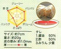
Graph (clockwise from top): Juicy, Crispy (Wrapper), Volume, Oily (lower = oilier), Garlic Amount, Vegetable Amount.
Stats: Size, Weight, Wrapper’s Thickness (Star Chart from Thick to Thin)
Sauce Breakdown: Soy Sauce %, Vinegar %, Extras
Here’s a sample image and the entire menu. (pdf, 3.2mb) Thanks for sharing this, Cabel.
